

Building Effective Landing Pages: Unleash the Power of Conversions in 2023
- 11 June 2023
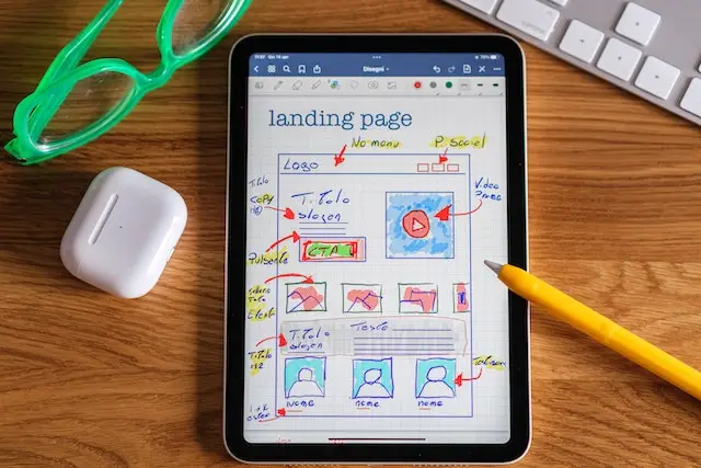
Building Effective Landing Pages: Unleash the Power of Conversions in 2023 Welcome to the world of building effective landing pages, where every click holds the potential to transform visitors into loyal customers. In today's digital age, a well-crafted landing page